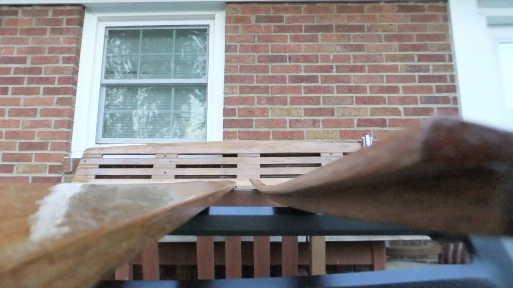
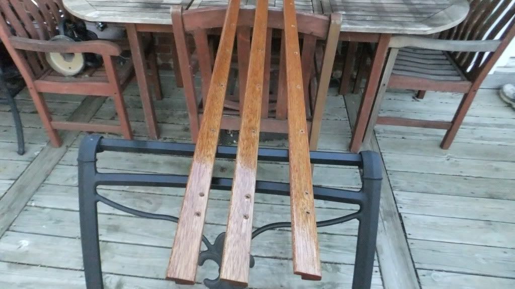
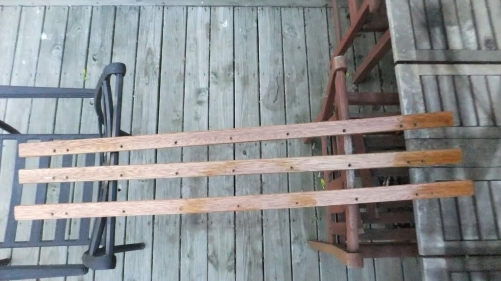
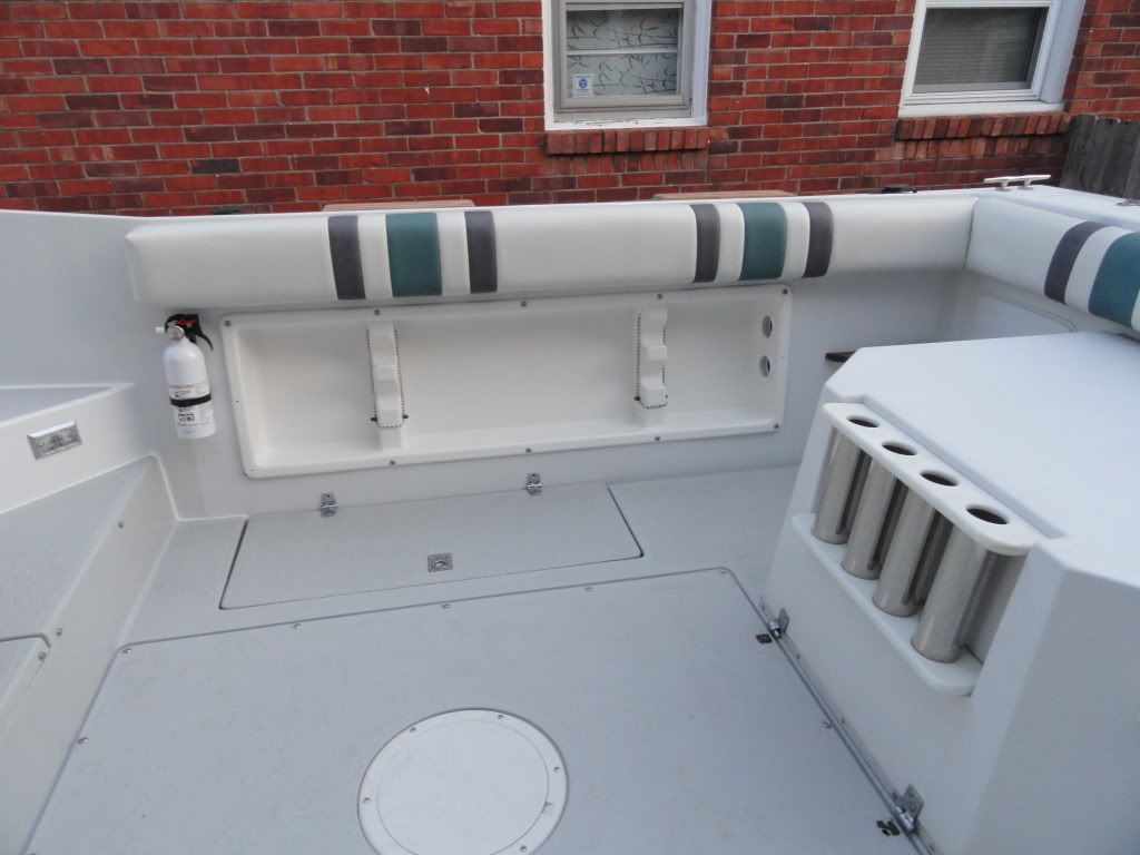
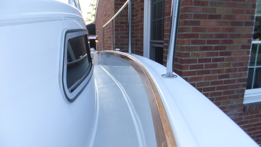
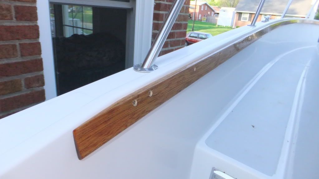
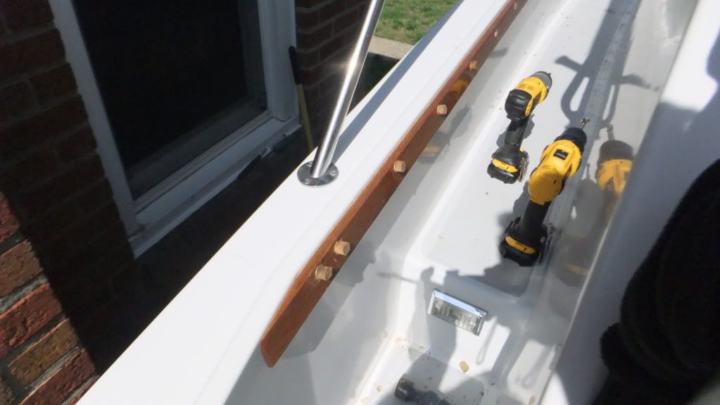
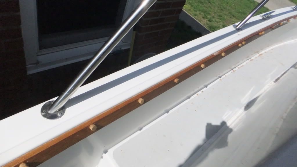
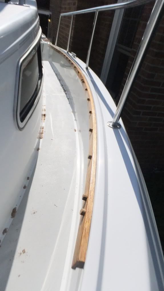
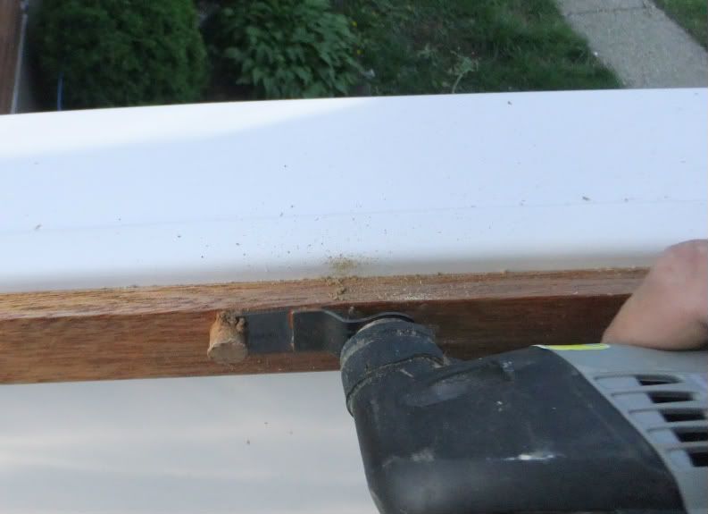
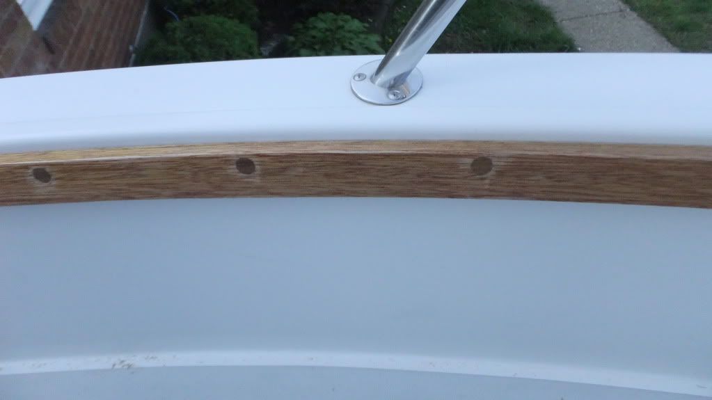
Thanks man, its far from finished look, but its getting there. The railings have to be removable for flooding. They will all get scribed on the bottom with a number.oooo...I do like that post and rail set-up!
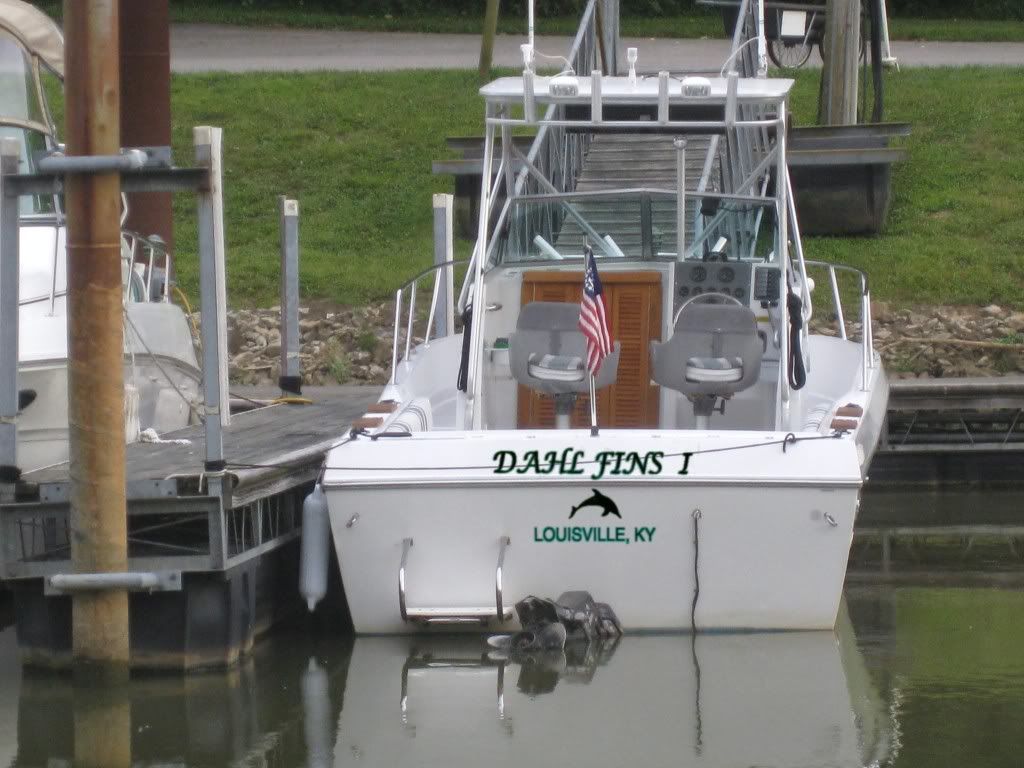
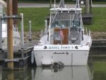
hey skipper,,lol,Hey guys, get you opinion on this. I took an old photo that I had a good shot at the stern and played around with a logo. Let me know what you guys think. I chose colors that will plat off the bolster pads and the future surround canvas for the hardtop. Dark teal color. I think it plays well with the teak color.
The lettering on the boat now is off the shelf, so I really want to get this done.
hey skipper,,lol,
diggen it! got 2 things tho, first is can ya stretch it out more sideways?
2nd thought,,,but more obvious, why dont ya carve that out like the logo on the front and make her glow
it's above the rubrail even,, that would be sick and finish it off with a pop
thats so sweet that the bow teak held the curve. almost there now,
get them business cards ready
Not going to cut into the transom on this boat. And I don't do anything that isn't clean looking, bolting something on is not an option,sorry. feel free to cut a logo into your boat though,lolgotcha,
that would be past the point of no return, understood.
what about a raised placard that would fit overtop of the transom above the rail,, kinda bolt on. you could make the rgb's at a 45+- backlit facing the fiberglass that would skinny the depth up a bit. and the white gelcoat would accept all the colors of the rgb's, i am not sure that you wouldn't get hotspots tho.
just a thought
I have played with the font you used, to plain for me. I have also used dolphins next to the logo, but there may be some rod holders going through on both sides of the name eventually basically for trolling.
lol, DAHL - FINS I get what your saying about the script. Script is hard to read unless you are right on top of it also. The only difference between the port name and the boat name is the port name is not shadowed with a darker color behind it. Just getting the basics together.I prefer your font and color choice for the boat name, but I lean toward southcogs idea for the Port name. The lighter color that you used for the Port name draws your eye to that rather than where it belongs, IMHO. The script font that southcog used is nice, but if you could find a script that is "more Louisville" I think that would be better. I don't know what I mean by "more Lousville", but I hope you get my drift.
Huh...Dahlfins in the Ohio River...who knew???
Whups:facepalm: Sorry to cause a commotion there CC ... more wanted to let you know you've got a fellow boater who does graphics all day ... every day. Glad to help if you want something real custom.
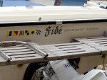
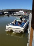
Here's what I did on mine. It's all standard vinyl that was real easy to get cut and put on.
View attachment 139052View attachment 139053
On mine, the flags spell out our last name on the left, the boat name is done in an old English because the word is a transliterated Latin word and our home town (no dock in the city limits at all ) is in the same font I did "Dahl Fins" on the Photoshop of your boat.
Going to have to reletter the seahawk logo on the cabin sides also or just leave it off, not sure what to do there yet either. :facepalm:
how about a frosted, or unfrosted for that matter , glass piece with your logo on top, trimmed out in 1/4 or 1/2 in teak just enough to hide the led's mounted along the edges, that would light the glass up and the letters would be dark instead of light?
not sure you get what i am thinken here. but if you put led's on the edge of glass it will light right up especially with the white background. and no i haven't given up the fight yet, lol
Not true, the bow trim is "screw on" and the screws will not be seen after dowel plugs are installed, sanded down and coated to match the rest of the trim boards.and remember your front gunwhale trim is bolt on,,, lol
With or without lights, Budd, that teak trim is outstnding!!! I might steal that idea!