


ajgraz
Lieutenant Commander
- Joined
- Mar 1, 2010
- Messages
- 1,858
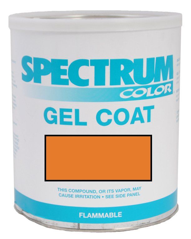
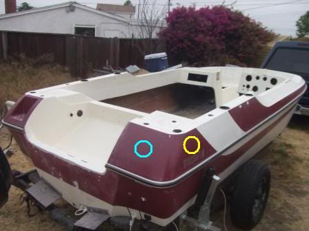
I'm refurbishing the tub, and keeping this color scheme (sort of an ivory with burgundy stripes; interior will be gray):
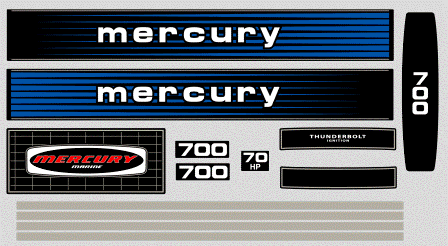
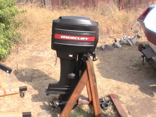
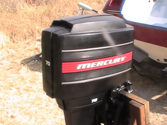
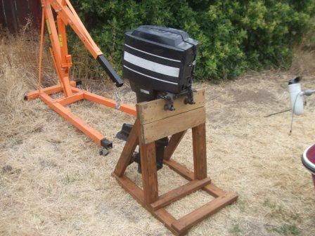
The 1979 70hp Merc motor had some kind of reproduction decals on it already, that are faded to nothing:
I am planning to paint the whole motor. Then, I could try to find $200 worth of original stickers, or try to find a decent-looking original cowling off EBAY, or get some good repro decals made ($$$?), or buy an incompete set of $40 repro's off EBAY that don't even look right (and all of these would be that mid-70's-early 80's blue that don't match anything on my boat anyway)...
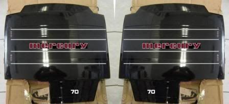
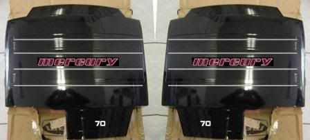
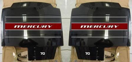
OR, I could get some inexpensive custom vinyl lettering and some pinstriping and do something like this (lettering/stripes would be like $25-$30 total for the whole cowling...that's my kinda budget") ):
):
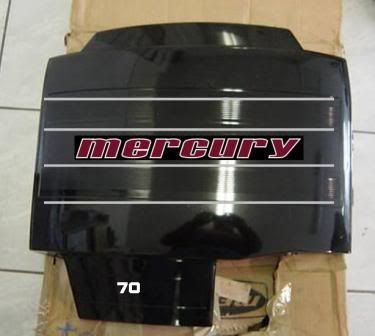
WTH, with my budget I'll not get anything that looks factory original, so why not try to do something that matches the boat? Besides, I only worked on that for 1 hour, and IMO that looks better than any decals Mercury ever put on motors from that vintage
So, what do you think of how that looks? Any suggestions for improvement?
Next Q: When I go to sell this whole rig in a few years, think potential buyers would be "put off" by non-factory-looking labeling on the motor? (Guess I could just peel it off and go all-black...which is kind of my "Plan B" anyway if I don't do any labeling)
The 1979 70hp Merc motor had some kind of reproduction decals on it already, that are faded to nothing:
I am planning to paint the whole motor. Then, I could try to find $200 worth of original stickers, or try to find a decent-looking original cowling off EBAY, or get some good repro decals made ($$$?), or buy an incompete set of $40 repro's off EBAY that don't even look right (and all of these would be that mid-70's-early 80's blue that don't match anything on my boat anyway)...
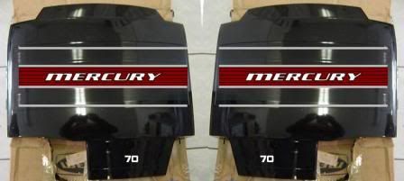
OR, I could get some inexpensive custom vinyl lettering and some pinstriping and do something like this (lettering/stripes would be like $25-$30 total for the whole cowling...that's my kinda budget
):
WTH, with my budget I'll not get anything that looks factory original, so why not try to do something that matches the boat? Besides, I only worked on that for 1 hour, and IMO that looks better than any decals Mercury ever put on motors from that vintage
So, what do you think of how that looks? Any suggestions for improvement?
Next Q: When I go to sell this whole rig in a few years, think potential buyers would be "put off" by non-factory-looking labeling on the motor? (Guess I could just peel it off and go all-black...which is kind of my "Plan B" anyway if I don't do any labeling)